Orange Money Pro: Streamlining Business Finance with Advanced UI Design and Robust Figma Integration
UI Design, Product Design, Mobile App Design, Prototyping and Interaction Design and Design System
The problem
When I joined the Orange Money Pro team, they were navigating a crucial phase of transition within the project, marked by a significant UI overhaul. During this transformative period, they had three primary objectives:
Contribute to the UI overhaul and migrate their existing design library from Sketch to Figma.
Implement an onboarding self-subscription system.
Establish a comprehensive Figma design system.
The solution
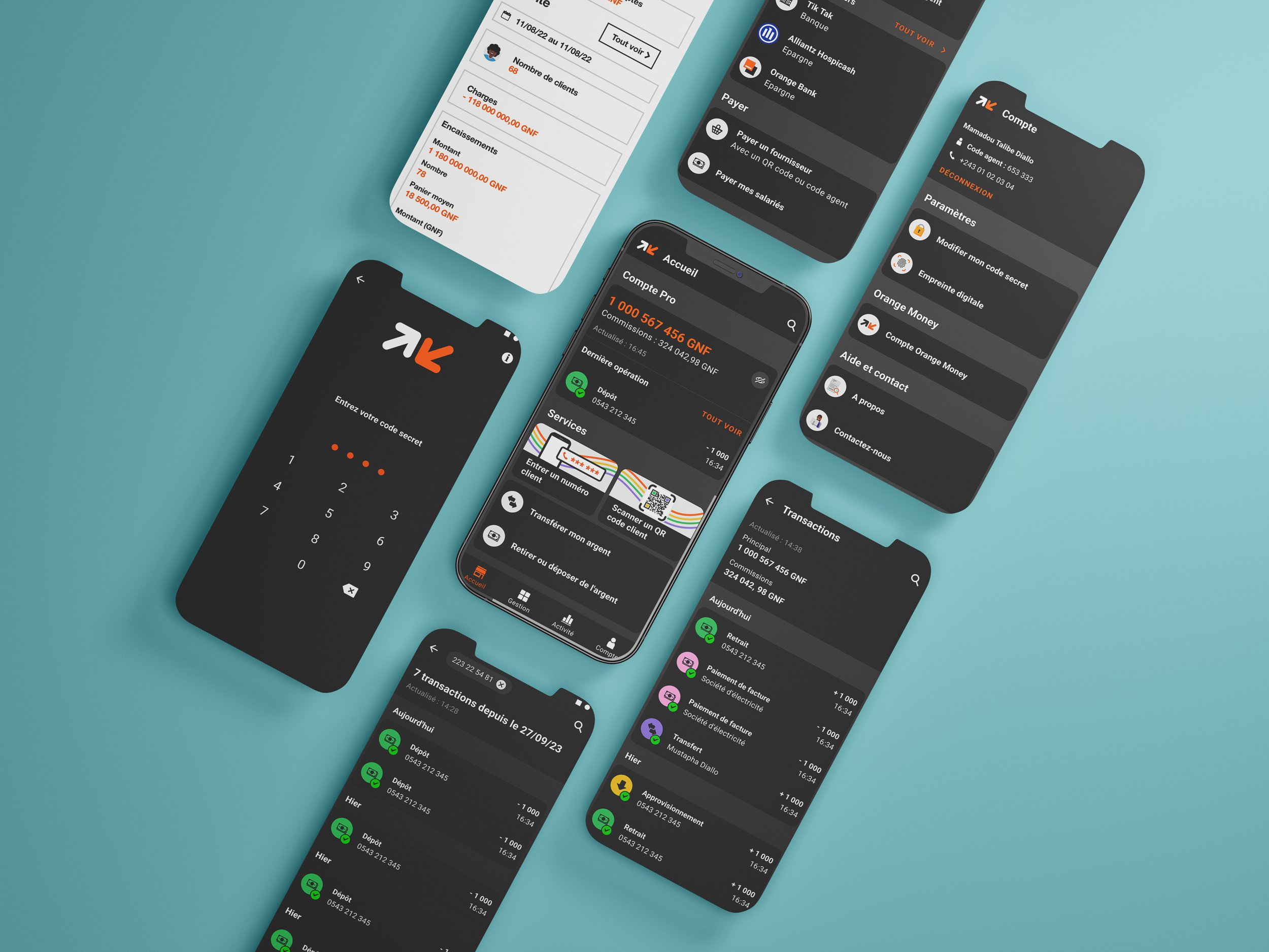
I redesigned the app in Figma, crafted a refined onboarding experience informed by my previous work with Orange Money Africa, and actively collaborated on developing a robust design system.
Results
The "Pro" designation suggests that the app is tailored towards businesses or professionals, potentially offering features suited to their specific needs, such as invoicing, payroll management, or business expense tracking.
There were notable distinctions in the self-subscription onboarding model I developed for this project, specifically tailored for business owners rather than consumers as in Orange Money Africa. A significant difference was the heightened document submission requirements for ID verification, reflecting the needs of a business-focused user base.
Selected redesigned key app screens.
Selected app issues taken from user feedback study.
(Selected redesigned key app screens).
(Selected app issues taken from user feedback study).
(Orange Money Pro - Onboarding demo)
The Orange design system encompasses a vast array of components spanning the company's global operations. My responsibility was to distill and curate the most pertinent elements for our project.
Given that the app is exclusively for Android, I focused solely on crafting components for this platform, omitting the need for an iOS version. Leveraging elements from the global library, I tailored custom components specifically for the OMP team's use.
The outcome enables any team member to swiftly assemble screens, integrate input components, and modify states while adhering to our established design guidelines.
Key screens taken from OMP Design System
(Key screens taken from OMP Design System)
Conclusion
The team successfully integrated a functional Figma file, complete with an implemented design system, alongside a revamped UI and an onboarding model primed for development.


